
POSTERS
One of the most fulfilling challenges for me as an illustrator and designer is making a poster. Whether it’s for a band, TV show, event, or just for fun, blending both disciplines into a really cool and effective graphic is my idea of a good time.
L’EMPEREUR
This was purely a personal project. I’ve always been in awe of illuminated manuscripts, and have wanted to do an illustration on real animal skin parchment - as opposed to the cheap dyed paper you can find in craft stores - for as long as I can remember. I chose this 18”x24” goatskin hide for its interesting mottled coloring, which was caused by tick bites when the animal was alive.
Parchment was much more difficult to work with than I imagined, and finding contemporary resources on its use was almost impossible. I ended up using a combination of calligrapher’s ink with a dip pen and Windsor & Newton fineliners to complete the drawing- and ‘killed’ about six fineliners in the process.
The illustration, itself, is a nod to a historical figure that has always fascinated me. Can you guess who he is?
DOWNTOWN OWL
When I found out that a favorite actor-duo (see: 100 LINKLATERS project) was going to co-direct a film I knew I wanted to design a poster concept for it.
Based on the novel of the same name by Chuck Klosterman, DOWNTOWN OWL is a dark comedy set in the fictional town of Owl, North Dakota in the days leading up to a disastrous blizzard. There was very little information about the film when I started working on this poster, so I based a lot of the details off of themes from the book- a closed movie theatre, a spilled cup of coffee, the highschool football team that can’t seem to land on a name, and graffiti disparaging a predatory coach. The design for the theatre itself is loosely based on the facade of the one I worked in throughout my college years, adding to the overall feeling of nostalgia- at least for me!
"SO DOPE!!"
"SO DOPE!!"
– HAMISH LINKLATER
TELL ME YOUR SECRETS
Another completely self-indulgent piece, this poster is based on an Amazon Prime show that I got invested in during the early months of the COVID lockdown. Full of plot twists and deeply troubled characters, TELL ME YOUR SECRETS drew me in and didn’t let go.
As with most of my work, I delighted in including as much detail from the show as I could. From business cards to jokes on soap dispensers, everything has a meaning- even the color choices!
WILCO SOLID SOUND FESTIVAL
When a coworker realized he wasn’t going to be able to meet his deadline for a gig-poster design for Wilco’s summer festival in Chicago he tapped me to take over. Inspired by vintage field guide illustrations, this poster features the flora and fauna native to the area that the festival would take place in.
As the design was meant to be screen printed I chose a simple palette of three colors and halftone patterns.
BACKGROUND NOISE
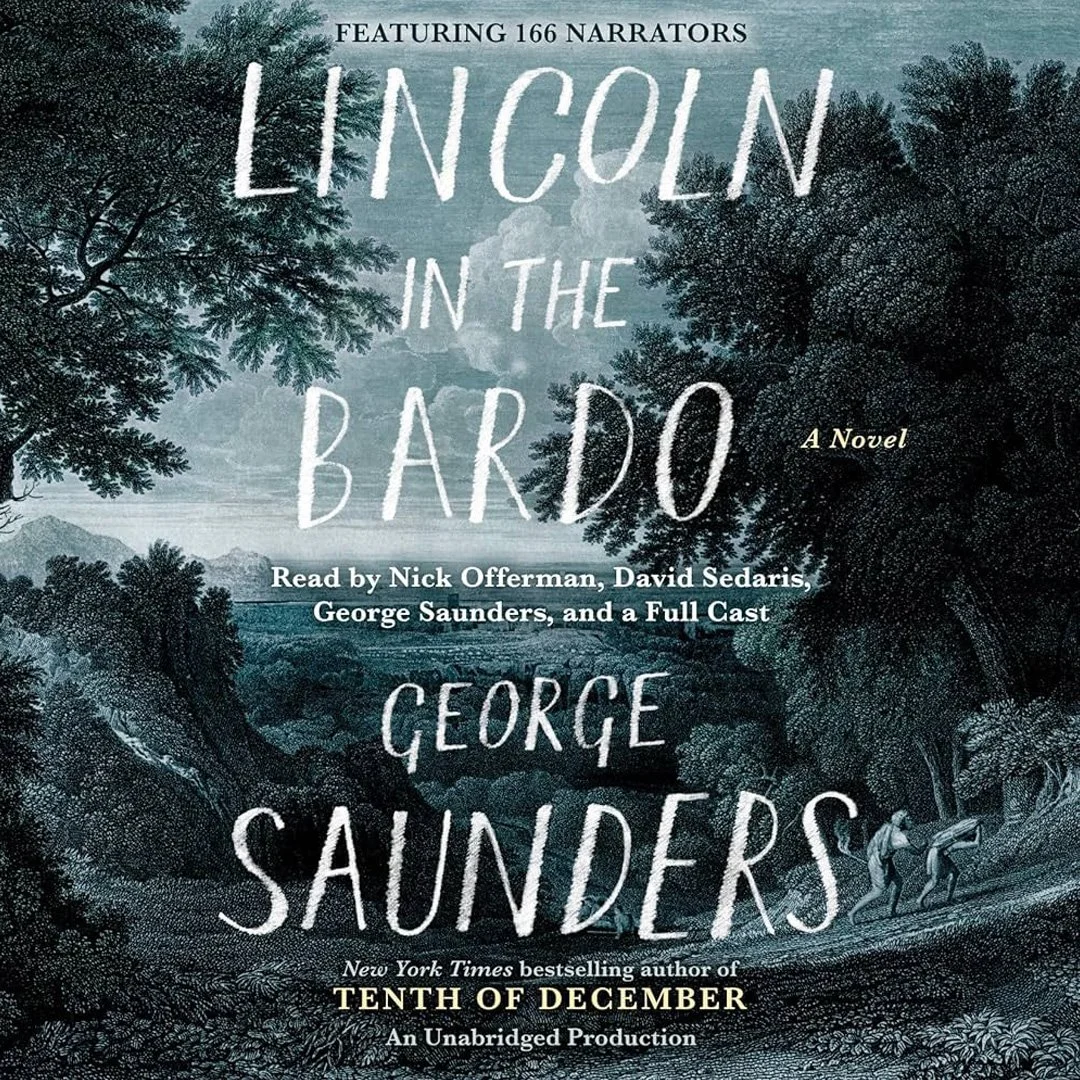
One of the many, many, many books I listened to while I worked on L’Empereur (seriously, that project took forever) has become one that I think about to this day, and have read more than once. LINCOLN IN THE BARDO by George Saunders is a strange, jarring, funny, thoughtful and heartbreaking novel about indecision, loss, and love.
Read by an enormous cast of recognizable names, including the author himself, I cannot recommend the audiobook enough- even if the first few chapters may seem wholly inappropriate for audio media.